

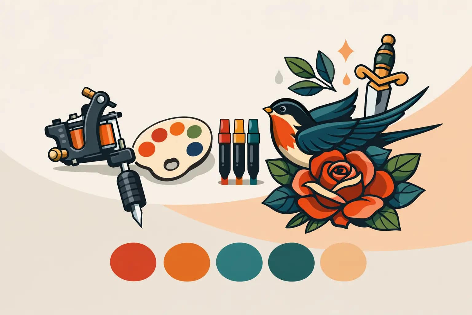
The difference between a good neo traditional tattoo and a great one often comes down to color. Linework gives the piece structure, but color is what sets the mood, creates depth, and keeps the design readable from across the room and years down the line. A strong neo traditional tattoo color guide is not about picking your favorite shades off a chart. It is about building a palette that supports the subject, fits your skin, and still looks intentional after the tattoo settles and heals.
Neo traditional work has a distinct visual language. It borrows the boldness of traditional tattooing, then opens the door to richer rendering, more nuanced shading, and broader color storytelling. That flexibility is exactly why color choices matter so much. With more options comes more room to create something incredible, but also more room to overwork a design.
What makes neo traditional color different
Traditional tattoos usually rely on a tighter, simpler set of colors. Neo traditional expands that range without losing the punch that makes classic tattooing hold up. You still want contrast, clarity, and bold decisions, but the palette can be more layered. You might see muted olive next to warm rust, deep teal against soft cream, or burgundy blended into a floral design that would feel flat in brighter primary colors.
That does not mean every neo traditional tattoo needs a complicated palette. In fact, some of the strongest pieces use fewer colors with better control. The style allows for sophistication, but it still rewards restraint. If every part of the tattoo is trying to be the star, nothing stands out.
A neo traditional tattoo color guide starts with the subject
The best palette usually comes from the subject matter itself. A tiger, rose, dagger, lady head, snake, raven, peony, or sacred heart each carries its own visual rhythm. Some subjects want heat. Others want softness, shadow, or tension. The right colors should reinforce that.
A rose can go far beyond red, but the alternative needs a reason. Black and deep maroon can make it feel dramatic and mature. Dusty pink and gold can soften it. Violet and crimson can push it toward something more romantic or gothic. None of those are wrong. The question is whether the palette matches the energy of the design and the story behind it.
The same goes for animals and portrait-inspired imagery. A panther with cool blue-black tones feels different from one built with warm browns and dark red accents. A female face framed with copper, moss, and cream tells a different story than one rendered in cherry red, black, and mustard. Good color direction is less about trends and more about intention.
Contrast is what keeps the tattoo readable
One of the biggest mistakes in neo traditional color work is choosing shades that are individually beautiful but too similar in value. On paper or on a phone screen, they may look refined. In skin, once healed, they can blend together and flatten the design.
A tattoo needs contrast to read clearly. That usually means balancing darks, midtones, and lighter moments in a way that guides the eye. Black outlines do a lot of heavy lifting, but they cannot fix weak color structure on their own. If the petals, leaves, and background details all sit in the same visual range, the design loses depth.
This is where experience matters. A strong artist is not just picking colors that look good side by side. They are thinking about how those colors will separate forms, direct focus, and hold legibility over time. A clean focal point and deliberate contrast will almost always age better than a palette built around subtle transitions alone.
Skin tone changes how color behaves
Every serious neo traditional tattoo color guide should say this plainly: skin is not white paper. Color sits in skin, not on top of it, and that affects how every pigment appears. The same green, yellow, or pink can look very different from one person to the next.
That is not a limitation. It is part of custom design.
On lighter skin, softer transitions and lighter tones may show more easily. On medium to deeper skin tones, stronger saturation and smarter contrast often create better long-term readability. Some pale pastels may fade into the skin visually, while richer jewel tones, warm reds, deep blues, and solid blacks can create more presence.
This is also why copying a tattoo directly from a reference photo rarely works. A palette that looked perfect on someone else may not perform the same way on your skin. The better approach is to treat references as inspiration and let the final color decisions be tailored to you.
Warm palettes, cool palettes, and mixed palettes
Warm palettes tend to feel bold, classic, and energetic. Reds, oranges, golds, and earthy browns can give neo traditional work a strong vintage backbone. They are especially effective for florals, animal subjects, fire elements, sacred imagery, and designs meant to feel intense or alive.
Cool palettes lean moodier. Blues, teals, greens, violets, and blue-black shading can feel elegant, mysterious, or atmospheric. They work beautifully in ravens, snakes, ornamental details, night themes, and designs where you want a calmer but still striking presence.
Mixed palettes often create the most dimension, but they need discipline. A warm focal point against cool supporting tones can be incredibly effective. For example, a red flower framed by dark green leaves and softened with cool shadows can feel richer than an all-warm palette. But if the balance is off, mixed palettes can turn noisy fast. Too many competing temperatures can make the tattoo feel confused instead of layered.
The role of black and negative space
People sometimes think color is the whole story in neo traditional work. It is not. Black and skin breaks are what let color breathe.
Solid black areas anchor the design. They create weight, help with contrast, and make surrounding colors appear more vivid. Negative space does something equally important. It gives the eye a place to rest and preserves shape. Without enough open skin or clear separation, even a technically strong tattoo can feel crowded.
This is especially important in larger custom pieces. Sleeves, back pieces, and multi-element designs need room to unfold. Packing color into every inch may feel impressive at first, but readability usually improves when some areas are intentionally quieter.
Choosing colors that age well
A tattoo does not stay fresh forever, and good design accounts for that from the start. Some colors naturally hold stronger than others, but longevity is not just about pigment. It is also about placement, sun exposure, saturation, skin tone, and how the palette is built.
High-contrast color schemes tend to age more gracefully because the structure remains visible even as the tattoo softens slightly over time. Designs with clear black foundations and purposeful color blocks usually keep their identity better than pieces that rely on delicate, low-contrast shifts.
That does not mean subtle color is a bad choice. It just means subtle color needs the right design support. If you love muted tones, that can absolutely work in neo traditional tattooing, but the piece still needs enough separation and strength to stay readable years later.
How to choose your palette with your artist
The consultation is where color should become specific. Bring references if you have them, but focus less on exact shades and more on what you respond to. Are you drawn to warmer tattoos or moodier ones? Do you want the piece to feel elegant, aggressive, romantic, spiritual, dark, or celebratory? Those answers are more useful than saying you like blue.
It also helps to be honest about where the tattoo is going and how visible you want it to feel. A chest piece can support a different kind of intensity than an inner arm tattoo. A full sleeve needs color relationships that work across multiple sessions and multiple elements. Placement changes how bold a palette should be and how the eye will read it on the body.
If you are working with a specialist, trust the pushback when it comes. Sometimes the color idea a client starts with is emotionally meaningful but visually weak. A good artist will not dismiss that. They will translate it into something stronger. That collaboration is where custom tattooing becomes more than decoration.
At Dani Olmos Tattoo, that part of the process matters because the goal is not just to make a design look good the day you get it. It is to create something that feels personal, balanced, and built to last.
Common color mistakes to avoid
The first is asking for every color you love in one tattoo. Even large neo traditional pieces need hierarchy. Too many unrelated hues can make the design feel scattered.
The second is underestimating how much black the tattoo needs. People sometimes worry black will make the piece feel heavy, but without enough foundation, the color often loses impact.
The third is choosing a palette based only on what is trending. Trend colors date faster than well-built tattoos do. Earth tones, jewel tones, or classic reds are not better simply because they are familiar. They work because they can be structured clearly and used with intention.
A great neo traditional tattoo color guide should leave you with one main idea: color is not a finishing touch. It is part of the architecture. When the palette fits the subject, the skin, and the long-term design, the tattoo does more than look vibrant – it feels complete. If you are planning a custom piece, choose colors that tell the story clearly now and still speak well for you later.