
A strong neo-traditional tattoo starts long before the stencil. It starts when the concept has enough structure to hold bold linework, enough personality to feel custom, and enough visual discipline to age well. If you are learning how to design neo traditional tattoos, the real job is not decorating a cool idea. It is building a design that reads clearly on skin, carries emotion, and still looks intentional years from now.
That is where a lot of designs either level up or fall apart. Neo-traditional gives you room for detail, texture, ornament, and stylized exaggeration, but it still depends on the same fundamentals that make any tattoo work – composition, hierarchy, flow, contrast, and durability. The style can be rich, but it cannot be chaotic.
What makes neo-traditional different
Neo-traditional grows out of traditional tattooing, so the backbone is familiar: strong outlines, readable shapes, and an image that holds together from a distance. The difference is in the expanded visual language. You can push color palettes further, build more dimensional forms, introduce illustrative textures, and create more nuanced symbolism than classic traditional usually allows.
That freedom is exactly why design discipline matters. Inexperienced artists sometimes treat neo-traditional as a license to add more of everything – more petals, more filigree, more shading, more tiny accents. But more detail does not automatically create a stronger tattoo. A neo-traditional design needs editing just as much as invention.
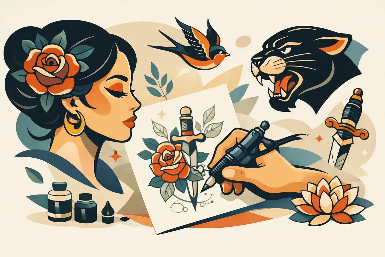
The best pieces usually feel rich without feeling crowded. They have a clear focal point, supporting elements that serve the main image, and enough open space to let the tattoo breathe. Whether the subject is a tiger, a woman’s portrait, a snake and dagger, or a peony with ornamental framing, the viewer should know where to look first.
How to design neo traditional tattoos from the concept stage
Before you sketch, define the story. That does not mean writing a novel about the piece. It means identifying the emotional center of the tattoo and the visual symbols that actually belong there.
If a client wants a memorial tattoo with a raven, rose, and pocket watch, the question is not how to fit all three in. The question is what each element is doing. Is the raven the main subject and the rose a supporting shape? Is the watch there for symbolism, or is it just visual filler because memorial tattoos often include clocks? Good custom design starts by separating meaningful elements from habitual ones.
Once the concept is clear, choose one dominant image. Neo-traditional works best when there is a visual anchor. Supporting details can frame, balance, or deepen the story, but they should not compete with the subject. If everything is shouting, nothing leads.
This is also the stage where placement should enter the conversation. A design for the outer forearm is not composed the same way as a shoulder cap, rib panel, or thigh piece. Skin is not a flat page. It wraps, stretches, and moves. A concept that looks balanced on paper may feel awkward on the body if the flow is ignored.
Build the design around shape first
A lot of tattooers are tempted to think in lines and details too early. Neo-traditional design gets stronger when you think in silhouette first. Reduce the piece to its large shapes and ask one simple question: does it read instantly?
If the answer is no, more rendering will not fix it. In fact, extra rendering often hides weak design. The main shape should be recognizable before the textures, color transitions, or decorative accents go in. A snake should feel like a snake in silhouette. A rose should have a believable mass. A face should have a clear value structure and framing shape before eyelashes and jewelry enter the picture.
This is where exaggeration becomes useful. Neo-traditional is not realism. You can enlarge petals, sharpen a jawline, widen a panther’s eyes, or simplify anatomy to create a more forceful tattoo image. Stylization is not cheating. It is part of the language of the style.
The trade-off is that stylization still needs control. If you distort every element equally, the piece loses hierarchy. Push what matters most and simplify what does not.
Linework sets the tone
Lineweight is one of the most defining parts of neo-traditional tattooing. The outer contour usually carries the most authority, while interior lines describe structure, texture, and separation. That difference in weight helps the tattoo stay readable over time.
When artists ask how to design neo traditional tattoos that age well, line hierarchy is part of the answer. If every line is thin and delicate, the design may look refined on day one but lose clarity as the tattoo settles. If every line is heavy, the image can feel clunky and overbuilt. The sweet spot depends on size, placement, and subject matter.
Faces, feathers, fur, floral folds, and ornamental details all need different handling. You want enough variation to create depth, but not so much complexity that the eye gets lost. Good linework design feels confident. It tells the skin what matters.
Color should support structure, not rescue it
Neo-traditional is known for lush color, but color is often misunderstood in the design phase. It is not there to save a muddy drawing. It should reinforce the structure that already works in black and gray.
Start with value contrast first. Even in a color tattoo, darks, mids, and light areas need a clear relationship. If the whole piece sits in the same middle range, it will feel flat no matter how attractive the palette is.
Then choose a color strategy that matches the mood of the subject. Warm reds, golds, and oranges create energy and drama. Cool greens and muted blues can feel eerie, elegant, or restrained. High contrast complementary color schemes hit hard, but they are not always the right choice for every concept. Sometimes a narrower palette gives the piece more sophistication.
Skin tone matters here too. Colors do not exist in a vacuum. They sit on top of living, changing skin. A palette that looks bright on white paper may behave very differently once tattooed. Designing for skin means understanding how contrast, saturation, and placement affect long-term readability.
Detail needs a reason
One of the pleasures of neo-traditional is decorative richness. You can build depth into petals, add patterned backgrounds, use jewelry, lace, smoke, leaves, or ornamental framing to give the tattoo a distinctive voice. But details should never feel borrowed just to make the design look busy.
A good rule is simple: details should either clarify form, strengthen flow, or deepen meaning. If they do none of those things, they are probably taking up valuable space.
This matters even more in medium and smaller tattoos. A chest panel or full thigh gives you room for layered information. A palm-sized forearm piece does not. Trying to cram a large-tattoo mindset into a small format is one of the fastest ways to lose legibility.
Composition is what makes it wearable
A beautiful drawing is not automatically a beautiful tattoo. Wearability is part of design. Neo-traditional tattoos should complement the body, not sit on it like a sticker.
That means considering direction, taper, and how the eye travels through the piece. A floral design may need to arc with the shoulder. A dagger composition may need to run with the forearm instead of against it. A portrait framed with foliage might need asymmetry to avoid looking stiff on a curved area.
For larger custom work, this gets even more important. Sleeves, back pieces, and connected bodywork need transitions between focal areas. If every section is built as a separate poster, the overall composition can feel fragmented. The strongest work has rhythm. One area leads naturally into the next.
Designing custom neo-traditional tattoos for real clients
The client’s story matters, but it should be translated through the logic of tattoo design. Not every meaningful symbol belongs in the same piece, and not every request should be taken literally.
Sometimes the best custom design comes from distilling a client’s idea into fewer, stronger elements. A person may arrive with ten references and five symbolic themes, but the final tattoo becomes more powerful when the artist identifies the core image and builds around that. That is the difference between collaboration and simple assembly.
In a custom process, trust matters. At Dani Olmos Tattoo, that is often where the strongest neo-traditional work begins – listening closely, identifying the emotional center of the piece, and shaping it into something visually bold enough to last.
For clients in Sacramento and beyond who want something personal, that artist-led design process is not a luxury. It is usually the reason the tattoo ends up feeling timeless instead of trend-driven.
Common mistakes when learning how to design neo traditional tattoos
Most weak neo-traditional designs fail in familiar ways. They overpack detail, ignore body flow, rely on trendy motifs without substance, or confuse decoration with composition. Another common issue is designing for a screen instead of for healed skin. Crisp mockups can create false confidence.
The fix is rarely more complexity. Usually it is better editing, stronger shape language, clearer line hierarchy, and a better understanding of what the tattoo needs to do at a glance.
If you are designing for yourself or working with an artist, ask whether the tattoo still works when simplified. Ask whether the focal point is obvious. Ask whether the design belongs to the body part it is meant for. Those questions will tell you more than any pile of references.
A great neo-traditional tattoo does not try to prove how much can be added. It proves how clearly an idea can be shaped, stylized, and carried on skin with confidence. Start there, and the rest of the design has something solid to grow from.