
A tiger wrapped around the arm, a dragon moving through wind bars, a panther head framed in roses – all can be bold, timeless tattoos. But irezumi vs western traditional is not simply a choice between two recognizable looks. Each style has its own visual language, history, relationship to the body, and way of carrying personal meaning.
For a custom tattoo, that difference matters. The strongest choice is rarely the one that looks best in a single reference photo. It is the one that fits your placement, your story, and the kind of tattoo collection you want to build over time.
What Defines Irezumi?
Irezumi refers to the rich tradition of Japanese tattooing. While the word is often used broadly in the tattoo world, Japanese tattooing carries a deep cultural history, established iconography, and compositional rules that deserve respect. Contemporary Japanese-inspired work can honor those principles while still being designed specifically for the individual wearing it.
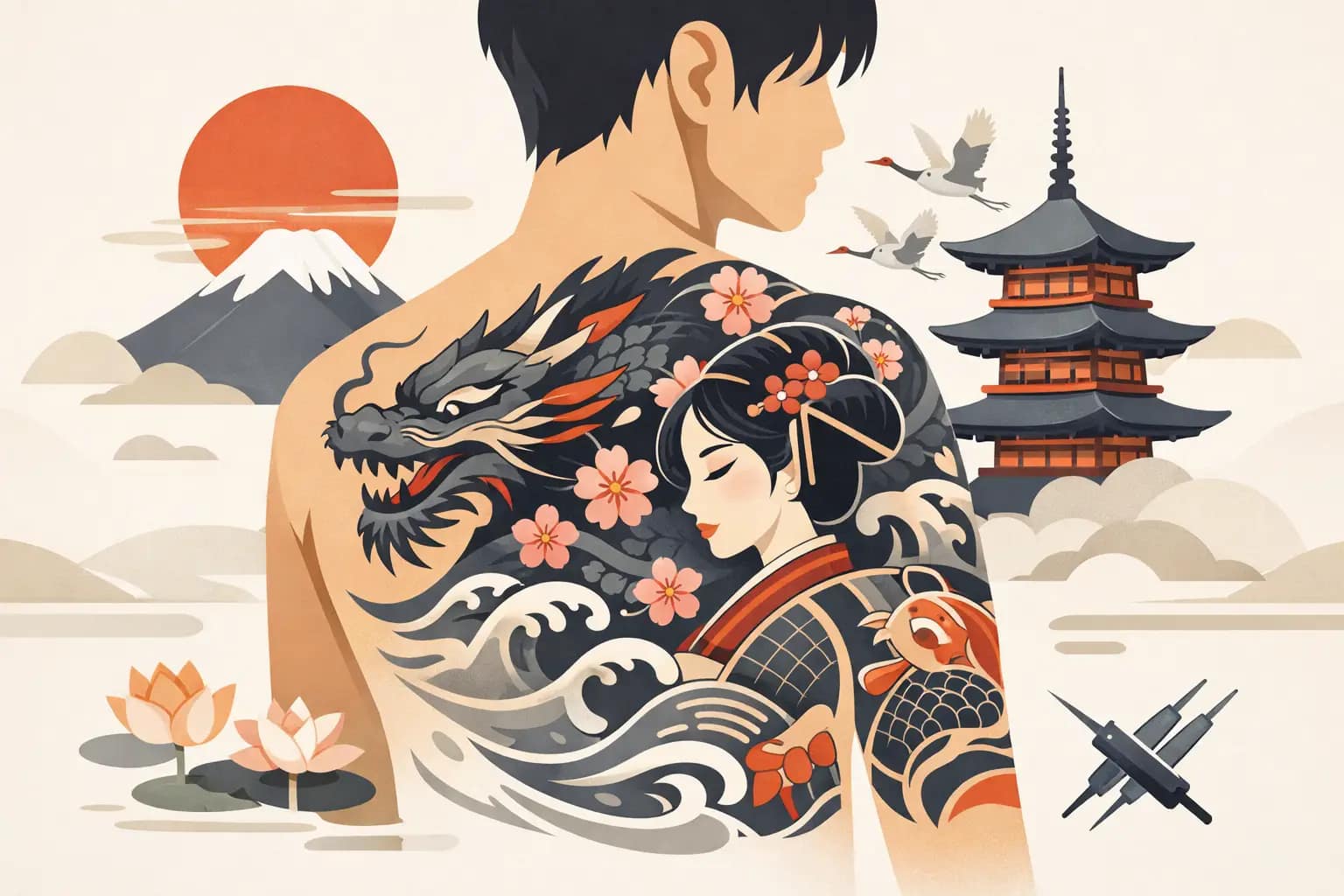
The first thing people notice is movement. Irezumi is built to work with the body rather than sit on top of it like a separate image. A dragon may coil from shoulder to chest. A koi may swim up the calf. Peonies, maple leaves, waves, clouds, wind bars, and background elements create a full environment around the main subject.
That is why Japanese work is especially powerful in larger placements. Sleeves, back pieces, chest panels, and leg sleeves give the composition room to breathe. The background is not filler. It connects the imagery, directs the eye, creates contrast, and gives the tattoo a sense of scale.
Symbolism is another defining feature. A koi can speak to perseverance and transformation. A tiger may represent courage or protection. Snakes, dragons, hannya masks, chrysanthemums, and phoenixes each bring their own associations. Still, symbolism should not be treated like a fixed menu. The meaning of a tattoo becomes more personal through the client’s relationship to the image, the placement, and the story behind the piece.
Color palettes often use strong blacks, reds, golds, greens, and muted natural tones, though black and gray Japanese-inspired tattooing can be equally dramatic. What holds it together is contrast: large areas of dark background, deliberate skin breaks, and clear focal points that remain readable from a distance.
Irezumi Is a Commitment to Composition
A single Japanese motif can absolutely work as a standalone tattoo. But traditional irezumi logic becomes most visible when the piece is planned as part of a larger composition. A sleeve is not just several tattoos placed near one another. It is one visual statement designed around the arm’s shape.
This requires patience, trust, and a willingness to think beyond the first appointment. If you know you eventually want a full sleeve, beginning with a cohesive plan can prevent difficult transitions later. A beautifully executed standalone piece can become harder to expand when its scale, direction, or background has not been considered.
What Defines Western Traditional?
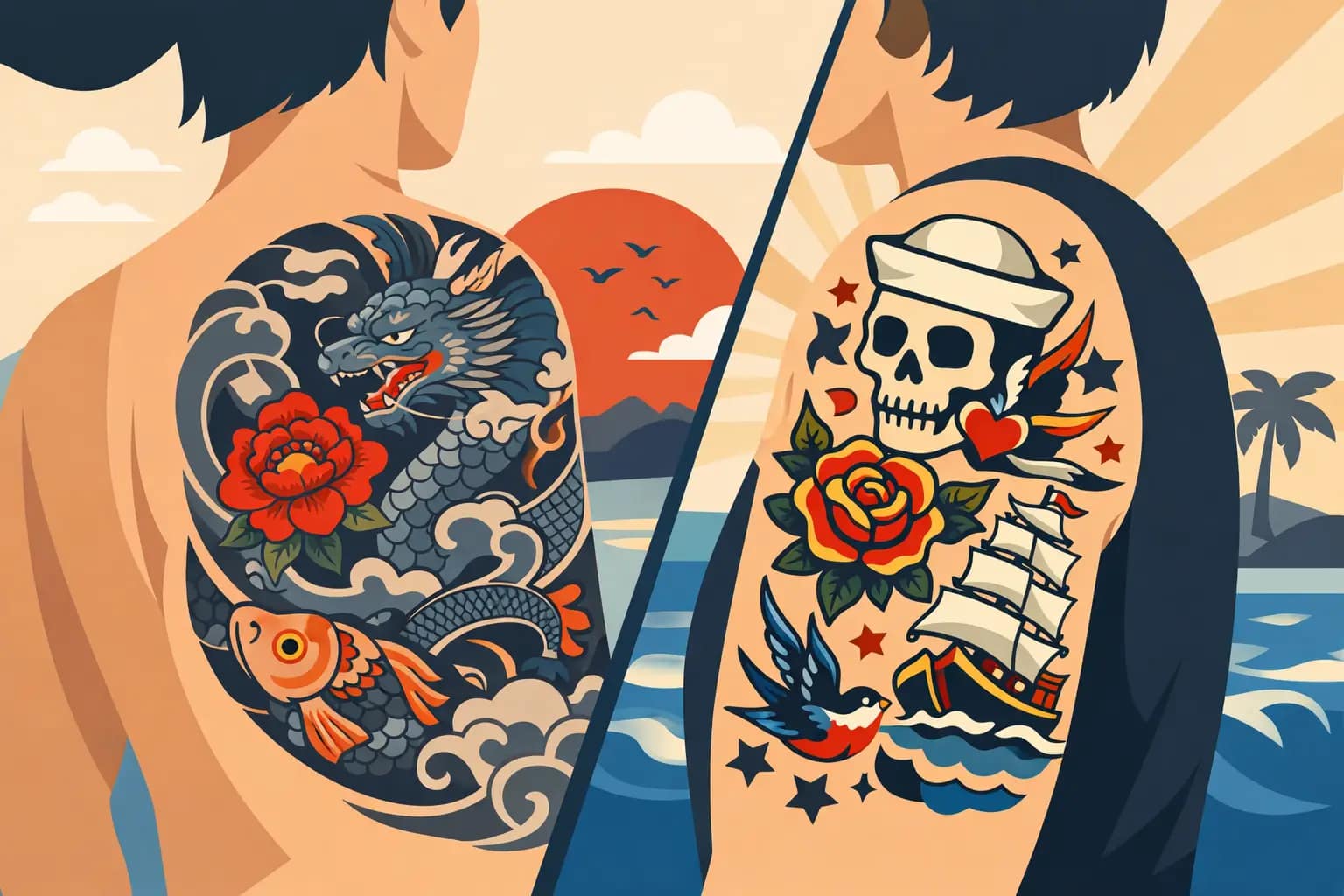
Western traditional, often called American traditional, developed through a different history. It is direct, graphic, and built around instantly readable images. Classic designs include eagles, panthers, daggers, ships, hearts, swallows, roses, pin-up imagery, skulls, and sacred symbols.
The style is recognizable for its bold black outlines, simplified forms, limited color palettes, and strong contrast. Red, yellow, green, black, and skin tone do much of the work. There is very little visual waste. Every line, shadow, and color field has a job.
Western traditional tattoos are often designed to stand alone. A panther head can hold its own on the forearm. A rose can sit cleanly on the hand. A dagger can fill a narrow space on the shin. This makes the style a natural fit for collectors who want individual pieces that still feel connected by shared line weight, color, and visual confidence.
That simplicity is deceptive. Strong traditional tattooing demands decisive drawing. There is nowhere to hide uncertain anatomy, weak composition, or muddy color choices. A design has to read quickly, fit the body, and hold its impact after years of wear.
The Power of a Clear Image
Western traditional is often the right answer when you want the tattoo to be immediate. The image should be understood from across the room. It does not need a detailed scene or extensive background to make its point.
That does not mean the work cannot be personal. A heart can represent family, loss, or devotion. A ship can hold meaning tied to travel, change, or home. Custom traditional work takes familiar visual language and gives it a specific reason to belong on your body, rather than copying flash simply because it is familiar.
Irezumi vs Western Traditional: The Key Differences
The most practical difference is how each style uses space. Irezumi tends to create a world around a primary image. Western traditional tends to make the primary image the world. One favors connected flow; the other favors bold, self-contained statements.
Their relationship to detail differs as well. Japanese-inspired work can include intricate scales, petals, faces, and atmospheric backgrounds, but it still depends on large readable shapes. Western traditional reduces imagery to its essential visual information. A rose does not need every petal rendered realistically to feel like a rose. In fact, clarity is the point.
Placement also changes the decision. A full back, chest panel, or sleeve naturally invites irezumi’s movement and scale. Smaller placements, gaps in an existing collection, and tattoos meant to stand independently often favor western traditional. There are exceptions to both. A compact Japanese frog or chrysanthemum can be excellent, while a western traditional sleeve can be thoughtfully composed. The question is whether the design logic matches the space.
Color is another consideration. Both styles are known for saturated color, black shading, and long-term readability. Japanese palettes often feel more atmospheric and layered, especially when background elements are involved. Western traditional color feels more graphic and punchy. Neither is automatically better. It depends on whether you want depth and movement or immediate icon-like impact.
Where Neo-Traditional Fits
For many clients, the most honest answer is not choosing one side completely. Neo-traditional tattooing takes the bold foundation and readability of western traditional and expands it with more dimensional shading, varied color, illustrative detail, and a broader range of subject matter.
A neo-traditional tattoo can borrow a Japanese-inspired palette, use a dramatic animal or floral composition, and still retain the graphic authority of traditional linework. It can also give a client more freedom when the subject is personal but does not belong naturally within classic Japanese or American traditional imagery.
The trade-off is discipline. Mixing influences works when the tattoo has a clear visual hierarchy. It becomes confused when every reference image is treated as equally important. A custom design should feel intentional, not like a collection of unrelated elements competing for attention.
How to Choose the Right Direction for Your Tattoo
Start with the body part and the scale you are willing to commit to. If you are drawn to a sleeve or large connected piece, Japanese-inspired composition may offer the strongest foundation. If you want a distinct tattoo that can live confidently on its own, western traditional may be the better fit.
Then consider what you respond to emotionally. Do you want an image with narrative flow, seasonal symbolism, and a sense of motion? Or do you want a straightforward emblem that hits hard and stays clear? Your answer may matter more than whether you can name every historical reference behind the style.
It also helps to look at your existing tattoos honestly. A full Japanese sleeve beside a collection of bold traditional tattoos can work, but the transition needs to be planned. Black density, color temperature, spacing, and scale all affect whether a body of work feels curated or accidental.
Finally, choose an artist whose portfolio shows fluency in the direction you want. The goal is not to force a style onto an idea. It is to develop your idea through a visual language the artist understands deeply. At Dani Olmos Tattoo, that collaborative process is central: the reference points matter, but the final design should be made for your body and your story.
A tattoo earns its place over time. Choose the style that still feels right when the initial excitement has settled – the one with enough craft, meaning, and visual strength to keep speaking clearly for decades.