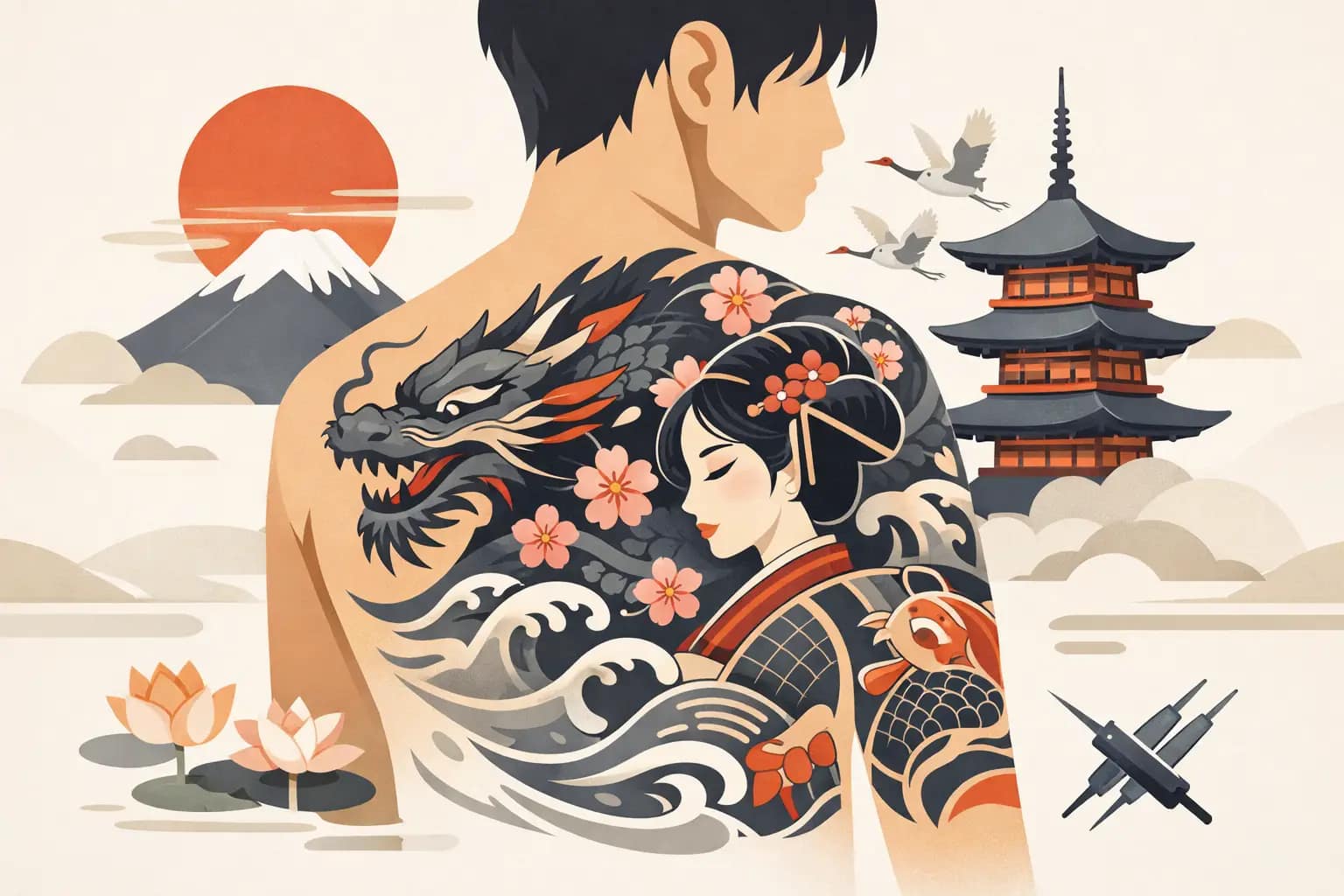

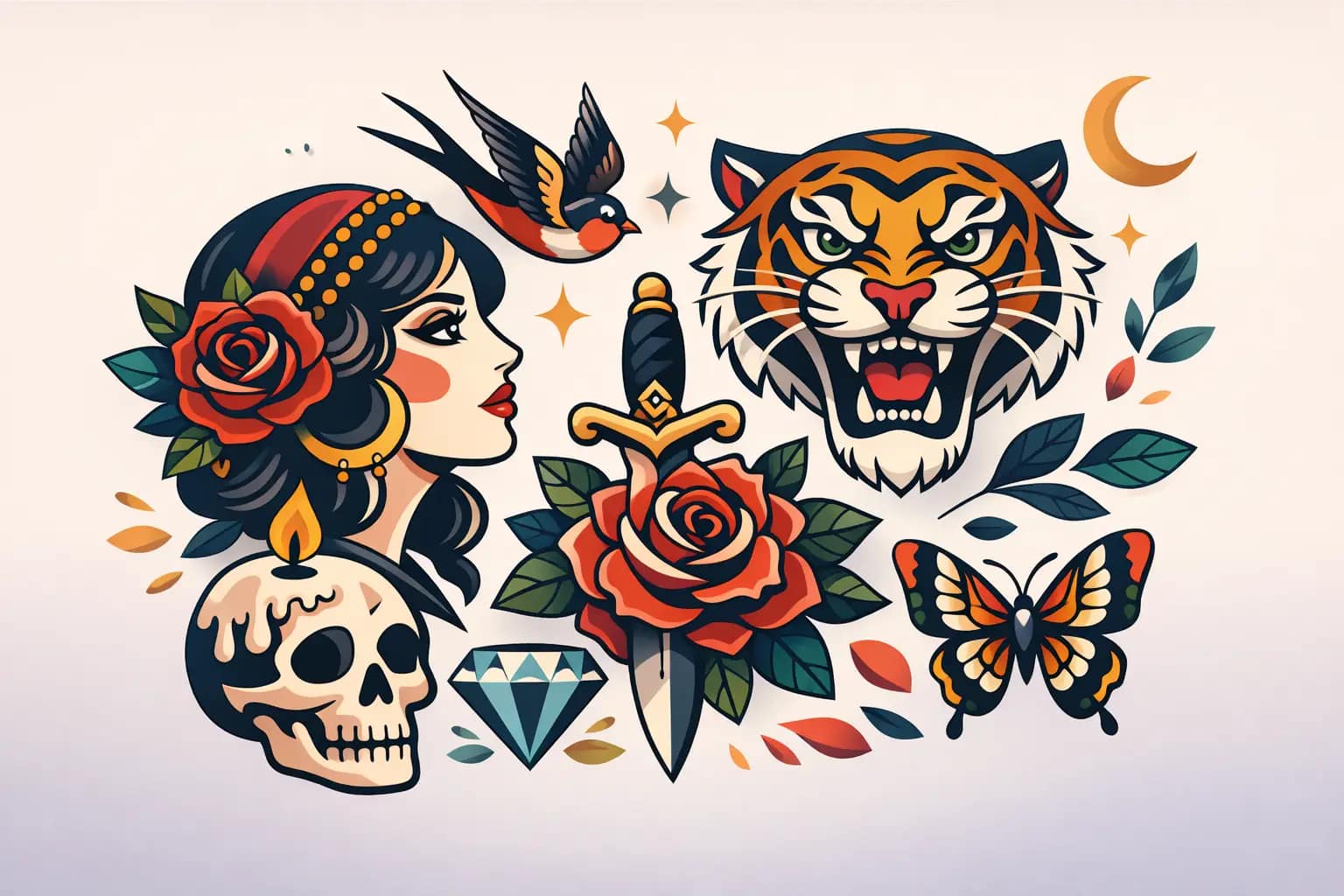
Some tattoos look exciting on day one and confusing five years later. A strong neo trad tattoo design avoids that problem by balancing bold readability with enough detail and personality to keep the piece interesting over time.
That balance is what makes neo-traditional work so compelling. It carries the backbone of traditional tattooing – clear shapes, confident linework, strong contrast – but gives the artist more room to build atmosphere, texture, symbolism, and custom storytelling. When it is done well, the result feels timeless rather than trendy.
What defines neo trad tattoo design
Neo-traditional tattooing grows out of American traditional foundations, but it is less rigid in how it handles form, color, and subject matter. You still see bold outlines and deliberate composition, yet the imagery can become more dimensional, more ornate, and more personal.
In practical terms, a neo trad tattoo design often features strong silhouette, saturated color, decorative detail, and a more illustrative approach to anatomy, flowers, animals, portraits, or symbolic objects. It does not chase realism. It stylizes. That distinction matters.
A good design in this style is not trying to copy a photograph exactly. It is trying to interpret a subject in a way that reads clearly from across the room and still rewards a closer look. That is where experienced design choices show up.
The foundation is readability
Before color palettes, textures, or fine details, the design has to read. If the shape is muddy, if the focal point gets lost, or if every section competes for attention, the tattoo may feel crowded no matter how technically well it is applied.
Readability starts with silhouette. You should be able to recognize the main subject quickly. A snake should feel like a snake. A rose should feel like a rose. A tiger head, dagger, raven, or mask should have a clear identity before secondary ornament enters the picture.
This is one reason neo-traditional tattoos tend to age well when designed correctly. Strong outer structure gives the eye something stable to follow. Detail can enhance that structure, but it should never replace it.
There is always a trade-off here. More detail can make a design feel rich and custom, but too much of it can flatten the image or reduce legibility over time. The right amount depends on placement, size, skin tone, and how much visual distance the piece needs to carry.
Color matters, but so does restraint
People often associate neo-traditional work with rich color, and for good reason. This style can handle deep reds, golds, greens, blues, and warm neutrals in a way that feels striking without becoming chaotic. But strong color does not mean using every color available.
The best palettes are edited. They support the mood of the piece and direct the eye toward the focal areas. If everything is equally bright, nothing stands out. If every petal, feather, jewel, and background accent demands attention, the design loses hierarchy.
Sometimes a limited palette is the stronger move. A piece built around black, muted red, ochre, and cream can feel more sophisticated than one packed with ten competing tones. Other times, high saturation is exactly right, especially when the subject calls for dramatic contrast and visual energy. It depends on the concept and on how the tattoo fits the client.
Skin also changes the conversation. Colors do not behave the same on every person, and good design accounts for that early. The goal is not just a tattoo that looks good in a digital mockup. The goal is a tattoo that lives well on skin.
Linework and shading create the voice of the piece
If composition is the skeleton, linework and shading are a big part of the tattoo’s personality. Neo-traditional work usually relies on line weight variation more than minimal styles do. Heavier outlines can anchor the design, while thinner internal lines help shape movement, depth, and ornament.
That variation gives the tattoo rhythm. It also helps separate important forms from supporting forms. Without that distinction, everything can start to blur together visually.
Shading does a similar job. In neo-traditional work, shading is often more sculptural and atmospheric than in classic traditional tattooing, but it still needs discipline. Too soft, and the tattoo loses punch. Too heavy, and it can become dense. Good shading supports dimension without sacrificing clarity.
This is where craftsmanship becomes obvious. A design may look beautiful on paper, but if the shading plan does not support long-term readability, the tattoo will not perform the way it should.
Custom symbolism is what makes the design personal
A neo trad tattoo design gets more powerful when it carries meaning that belongs to the client, not just the style. That does not mean every tattoo needs a long backstory, but it should feel intentional.
The strongest custom pieces often combine a clear central image with symbolic layers. A panther might represent resilience. A chrysanthemum may speak to perseverance or transformation. A sword, lantern, snake, or swallow can shift meaning depending on what the client brings to it.
This is where collaboration matters. The artist’s role is not only to draw well. It is to translate ideas into visual language that fits the body and the style. Sometimes that means simplifying a concept so the tattoo stays strong. Sometimes it means combining influences in a way that feels original instead of forced.
Clients occasionally come in with too many ideas packed into one piece. That is common, especially when the tattoo is meant to carry real personal weight. The answer is not to cram everything in. The answer is to identify what matters most and build around it. A focused design almost always feels stronger than a crowded one.
Placement changes everything
A design that works beautifully on the thigh may fail on the forearm. A chest piece has different compositional demands than a calf, ribcage, or half sleeve. Neo-traditional work shines when the design respects the natural movement and shape of the body.
Flow matters as much as subject matter. Curved elements can wrap and guide the eye. Background shapes can support muscle structure. Open skin can give the main image room to breathe. These decisions are subtle, but they are often the difference between a tattoo that sits on the body and one that belongs there.
Size is part of that conversation too. Clients sometimes want a visually complex concept in a space that is simply too small for it. A good artist will say so. That is not resistance. That is design honesty.
In a custom studio setting, this is one of the biggest advantages of the process. The design is not pulled off the wall and resized at random. It is built for the person wearing it.
Neo trad tattoo design and long-term aging
A tattoo should not be judged only by how it looks fresh. Healed results matter. Five-year results matter. Ten-year results matter.
Neo-traditional work generally holds up well because it is built on strong fundamentals, but aging still depends on design decisions. Clean separation between forms, enough negative space, confident linework, and controlled detail all help the tattoo remain readable as the skin changes naturally over time.
This is why trend-heavy micro detail can be a risk if it is pushed too far. Intricate does not always mean durable. The most impressive tattoo is not the one with the most information packed into it. It is the one that still looks intentional years later.
For clients investing in a meaningful custom piece, that should be part of the conversation from the start. A tattoo is not just an image. It is a long-term composition on living skin.
When this style is the right fit
Neo-traditional is a strong choice for people who want boldness without simplicity, and artistry without losing structure. It works especially well for clients drawn to classic tattoo language but who want more range in imagery, color, and storytelling.
It may be less ideal for someone who wants pure realism, very fine minimalist work, or something intentionally understated. Neo-traditional tattoos tend to have presence. Even when they are elegant, they are rarely timid.
For many custom clients, that presence is exactly the appeal. The tattoo feels designed, not generic. It can honor traditional tattoo principles while still making room for personal symbolism, decorative richness, and a more refined artistic point of view.
At Dani Olmos Tattoo, that custom approach matters because the best work does not begin with a trend. It begins with listening, drawing, editing, and building a piece that can hold its power for years.
If you are considering a neo-traditional tattoo, look past the first impression and pay attention to structure, flow, and meaning. The right design does more than catch attention. It keeps speaking clearly every time you see it.