

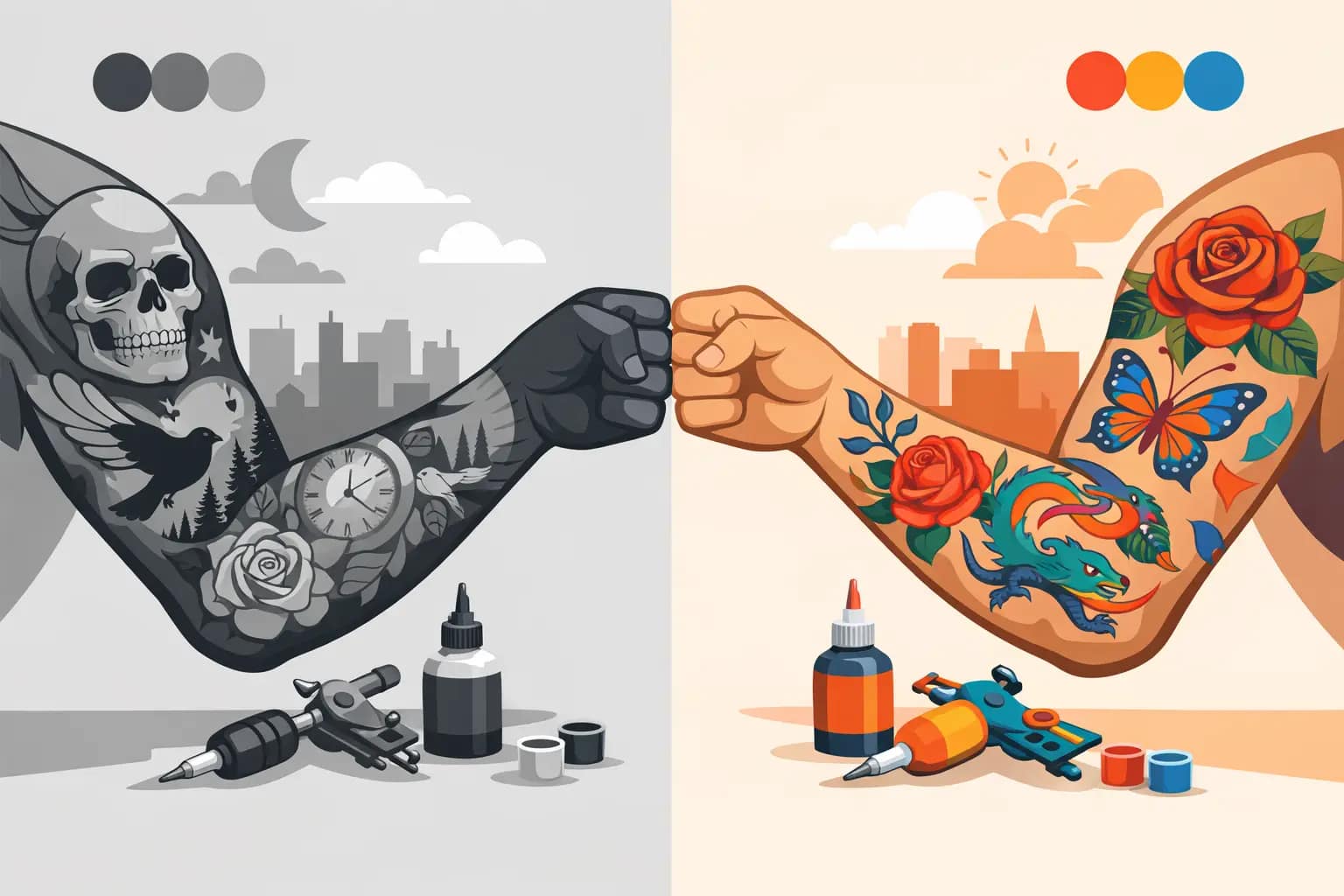
Some tattoos look right in your head only after you answer one deceptively simple question: black and grey vs color tattoos. It is not just a style preference. It affects mood, readability, aging, skin interaction, and how your tattoo tells its story years from now.
For custom work, that choice matters even more. A large Japanese sleeve, a Neo-Traditional back piece, or a symbolic custom design is not decoration you swap out next season. It is a long-term visual commitment, so the better question is not which option is “better.” It is which one fits your concept, your skin, and the way you want the piece to live on the body.
Black and grey vs color tattoos: what really changes
The biggest difference is emotional impact. Black and grey tattoos tend to feel atmospheric, dramatic, and timeless. They rely on contrast, shading, texture, and negative space to create depth. Even when the subject is bold, the overall impression is often more restrained and cinematic.
Color tattoos speak differently. They can feel louder, warmer, more celebratory, or more iconic depending on the palette. Saturated reds, golds, greens, and blues can push a design toward high energy and immediate visual punch. In Japanese and Neo-Traditional work, color often helps separate major elements and gives the design a stronger rhythm from a distance.
Neither approach is automatically more advanced or more meaningful. A black and grey tattoo can be incredibly bold. A color tattoo can be refined and subtle. The real shift is how the design carries contrast and where the eye goes first.
How style influences the right choice
Style should lead this decision more than trend.
In Japanese-inspired tattooing, color often plays a major role because the visual language was built around strong symbolic contrast. A koi, peony, dragon, hannya, or chrysanthemum can become more legible and dynamic when color separates forms and emphasizes movement. Reds can create intensity, blues can cool a composition, and gold tones can bring warmth that black and grey simply cannot imitate in the same way.
That said, black and grey Japanese work can be striking when the goal is mood, elegance, or a more understated presence. Wind bars, waves, clouds, and background texture can become the star. The piece may feel more cohesive across larger body areas, especially if you want a sleeve or bodysuit effect that reads as one unified composition rather than a series of bright focal points.
Neo-Traditional designs can go either direction beautifully. Color usually leans into the style’s bold outlines and graphic structure. Black and grey can make the same style feel more sculptural and serious. If the design depends on floral richness, jewel tones, or strong symbolic color associations, color tends to do more work. If it depends on facial expression, ornamental shading, or dramatic depth, black and grey may be the stronger path.
Skin tone matters, but not in the way people often think
One of the most common misconceptions is that color tattoos only work on lighter skin. That is not true. Color works on a wide range of skin tones, but it needs to be chosen intelligently. The palette, saturation, contrast, and placement all need to respect the skin it is going into.
Black and grey often has a naturally broad range because it is built on value rather than hue. It can read clearly across many skin tones, especially when the design uses strong contrast and enough open space. That does not mean it is always the safer or better option. It means the artist has to understand how healed pigment sits in the skin and design for long-term readability.
Color requires the same level of planning, just with more variables. Some shades may appear more vivid or more muted depending on undertone and depth of complexion. A thoughtful artist does not force the same palette onto every client. They adjust. Warmer colors, deeper tones, and high-contrast combinations can create incredible results when chosen with experience.
This is where custom design matters. The best tattoo is not based on what looked brightest on someone else. It is built around what will look strongest on you.
Black and grey vs color tattoos over time
Every tattoo ages. The goal is not to avoid aging. The goal is to create a tattoo that still looks powerful as it settles and softens.
Black and grey tattoos often age with a little more visual forgiveness because the palette is simpler. As the tattoo heals and naturally changes over the years, smooth shading and strong foundational drawing can continue to look elegant. Fine detail can still soften, of course, but a well-built black and grey piece often maintains its mood and structure gracefully.
Color tattoos can also age beautifully, especially when they are applied with solid saturation, clean linework, and a design that respects spacing. But color gives you more chances to win and more chances to lose. Poor color choices, overcrowded detail, or weak contrast can make a tattoo feel muddy faster. Strong composition solves a lot of that.
Sun exposure matters for both. If you spend a lot of time outdoors in Northern California, aftercare and long-term protection are not optional. Black ink can fade. Color can fade. Good tattooing helps, but your habits still shape the result.
Pain, sessions, and healing
Clients often ask whether black and grey or color hurts more. The honest answer is that placement matters more than pigment. Ribs, knees, spine, elbows, hands, and feet will usually get your attention no matter what style you choose.
That said, color work can sometimes require more packing and repetition in certain areas, especially if the design includes dense saturation. Depending on the piece, that may mean the process feels more intense or takes additional time. Black and grey often allows for smoother gradients and softer transitions, which can feel different during the session, though not always easier.
Healing can also look different. Color tattoos may appear more vivid, more textured, or more dramatic during the early healing stages. Black and grey usually settles in with a softer shift. Neither should be judged too early. Fresh tattoos do not tell the whole story.
Choosing based on concept, not impulse
The strongest tattoos start with concept first, palette second.
If your piece is rooted in memory, grief, mythology, or a darker visual atmosphere, black and grey may serve the idea better. It can create emotional weight without needing visual noise. Portraiture, sacred imagery, smoke, masks, animals, and ornamental compositions often become more powerful when they rely on tonal depth.
If your concept depends on symbolism that has traditional color associations, color may be the right language. Japanese subjects especially can gain meaning and movement from specific palettes. A phoenix, koi, tiger, snake, or floral arrangement can feel more alive and more structurally balanced when color helps organize the composition.
There is also a middle path that many clients overlook. You do not always have to choose full black and grey or full color. Black and grey with selective color can work when it serves the design rather than feeling like a gimmick. The key is restraint. One intentional accent can elevate a piece. Random color usually weakens it.
What to ask before you decide
Before committing, think about how visible you want the tattoo to be in daily life. Color generally announces itself faster. Black and grey can still be bold, but it often reads with a quieter confidence.
Consider the scale too. Small tattoos can lose subtle distinctions over time, so the palette should support readability. Large-scale custom work gives more room for either direction to breathe. If you are planning a sleeve, chest piece, or back piece, the overall flow matters more than which shade looked coolest in a reference image.
Ask yourself what you still want to love ten years from now. Not what feels exciting for one season. Not what photographs best on a screen. What still fits your taste, your story, and your body as you grow into it.
And finally, choose an artist whose strengths match the direction you want. This is especially important with custom Japanese and Neo-Traditional work, where composition, symbolism, and long-term clarity all matter. A strong artist will not just ask whether you want black and grey or color. They will explain why one may serve your design better than the other.
The best tattoos are built for the long run
Black and grey vs color tattoos is really a question about how you want the piece to feel every time you see it. Quiet and dramatic. Bold and vibrant. Minimal in palette or rich with symbolism. When the design is custom, the right answer usually becomes clearer through the conversation, not before it.
If you are investing in a meaningful tattoo, give the choice the attention it deserves. Great work is not just about what looks impressive fresh. It is about what still feels true, balanced, and beautifully made long after the session ends.